

Design
Supernova: SuperStyle magazine
Creative design and graphic design of the magazine, editing.
Žito d. o. o.
creative design for a campaign, graphic design, communication, direct marketing, PR content, advertising
Žito d. o. o.
creative design for a campaign, graphic design, communication, direct marketing, PR content, advertising
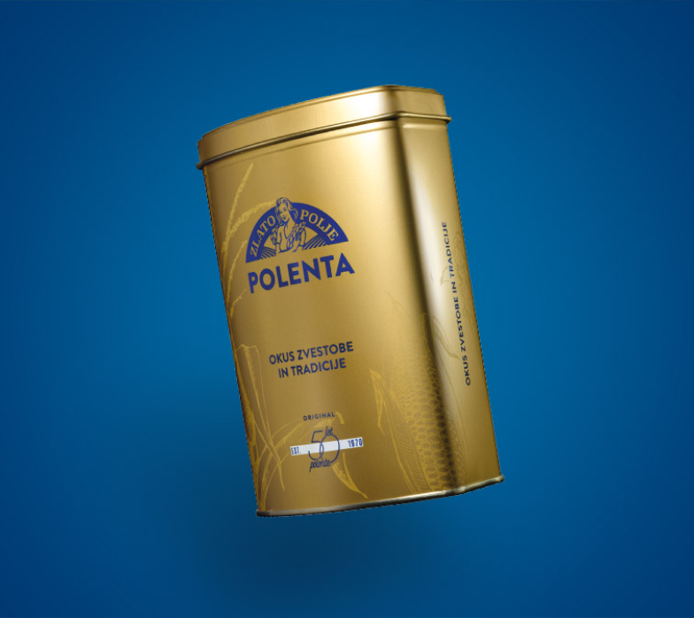
From the very beginning, the Zlato polje brand has been synonymous with the highest quality. The tradition of polenta has been delighting generations with its flavour for half a century, which is why ŽITO, on the occasion of its golden anniversary, wanted to remind all culinary enthusiasts about the dish that our grandmothers and mothers used to serve us.
On the occasion of the 50th anniversary of polenta from the Zlato polje brand, how can we present the taste of tradition and the core values of the brand in a modern way, paying tribute to the dish that our grandmothers and mothers used to serve us?

The communication strategy combines the recognisable elements of polenta from Zlato polje – the logo and the colour scheme of the brand’s visual identity, the anniversary logo and the “50 years of polenta” packaging. The warmth of the slogan, which brings together all the values of Zlato polje, completes the communication.
The strategy included the design of PR content and the production of ads and web banners, which were distributed across online and printed media. We used this content to strengthen the brand’s reputation and raise awareness of polenta’s tradition and signature taste. At the same time, we highlighted the fact that polenta can be part of a balanced diet, as it has a favourable nutritional composition and is recognised as a good companion to modern diets.

On the 50th anniversary of polenta, we highlighted the taste of tradition and the core values of the Zlato polje brand. We wanted to introduce polenta and the dishes that can be made from it to young culinary enthusiasts in a modern and creative way, while also reminding our mothers, grandmothers and grandfathers of this traditional dish and the unique taste of polenta.

Golden yellow and creamy polenta has been trending for half a century. The slogan of its 50th anniversary campaign, “Golden polenta that has been delighting us for years”, is in line with the values of Zlato polje (natural ingredients, flavour, tradition and high quality) and highlights the distinctive golden yellow colour of the cornmeal.
An important element in raising brand awareness was the distribution of the recipe booklet Ustvarjajmo z zlato klasiko to households across Slovenia.
Through creative design, content and graphics, the booklet presents the key elements of the Zlato polje polenta visual identity, through which we learn about the brand’s values (taste, tradition and high quality). It contains inspired and modern polenta recipes by culinary expert and blogger Sašo Šketa.