
Design
Supernova: SuperStyle magazine
Creative design and graphic design of the magazine, editing.
Atelier Karim
the conceptual and creative design of the packaging system and signboard, stylistic finishing of the logo
Atelier Karim
the conceptual and creative design of the packaging system and signboard, stylistic finishing of the logo
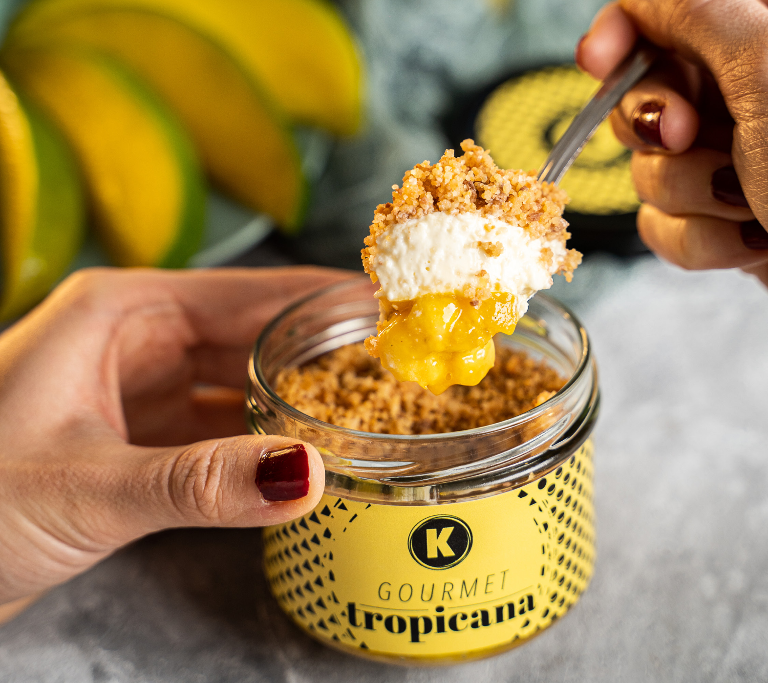
Atelier Karim, the boutique patisserie of the renowned Slovenian patissier and chef Karim Merdjadi, is famous for its exquisite confectionery in innovative flavour combinations. Karim’s delicacies are perfect for both every day and special occasions – and, of course, for festive gift-giving and pampering.
The client’s wish was to redesign the packaging of the existing Brownies, Cookies, Tropicana, Tiramisu and Chococaramel products and to create an illuminated sign that would increase the visibility of their boutique store in Ljubljana. After a few sessions treating ourselves to Karim’s delicacies, we came up with a creative solution that delighted the client – and soon after, many dessert lovers.
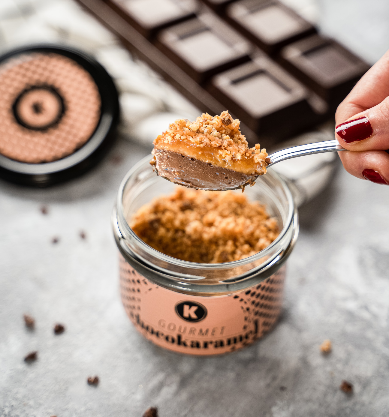
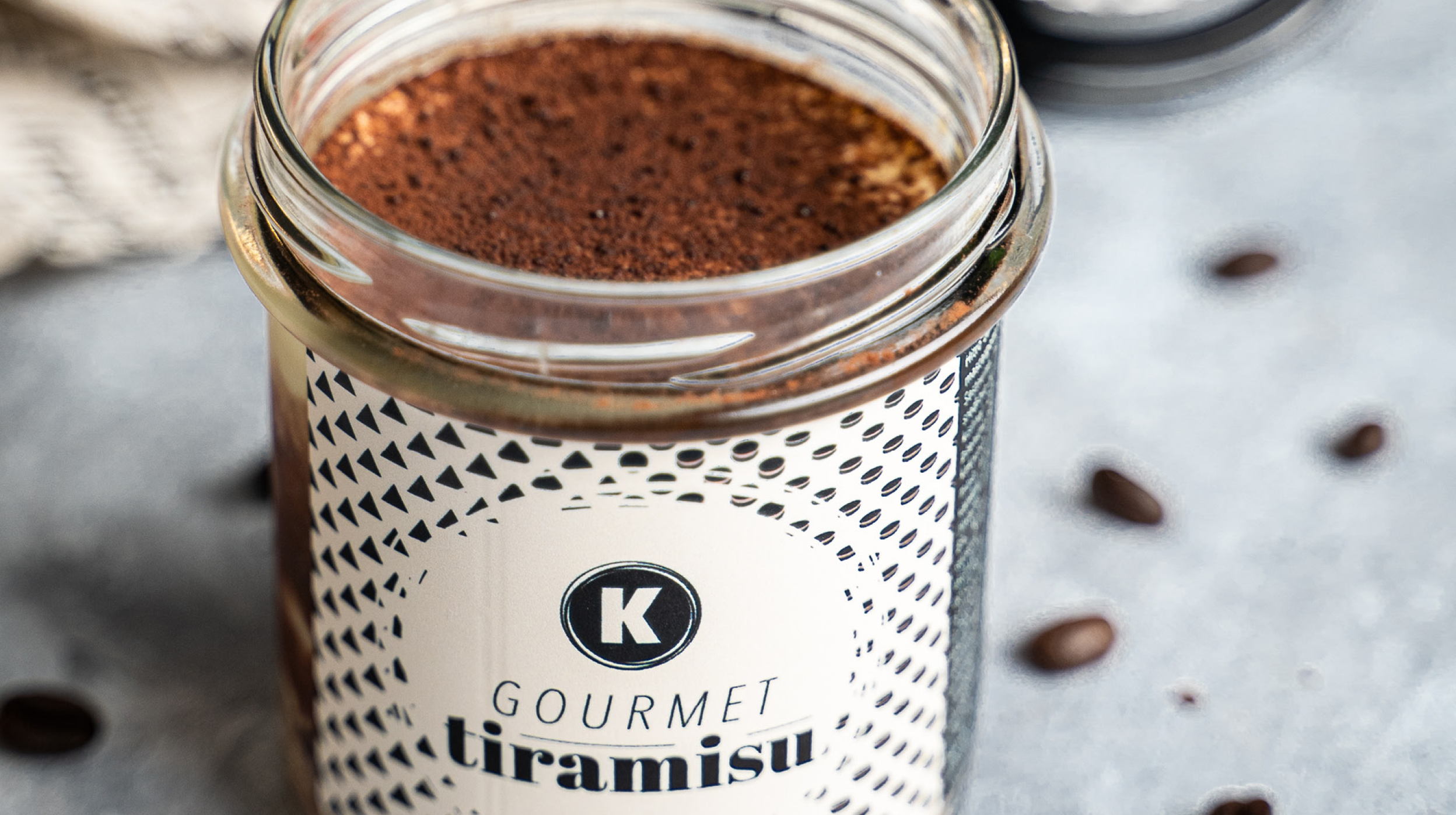

The first step in the redesign of the packaging system was to stylistically refresh the logo. The typography of the Karim lettering, which had too much of a time-worn aesthetic, was updated with an unobtrusive change – a timeless typography that adds a timeless component to the logo and ensures that it is more present, stronger, more visible and more in tune with the redesigned packaging.


For the packaging labels, we designed a unique pattern that links entire product line on different colour backgrounds.
We took inspiration from two basic geometric shapes, symbolically representing a cake and a macaron, and “fused” them into a unique pattern that encapsulates Karim’s entire range of products, from macarons to cakes, with all the delicacies in between. The minimalist aesthetic of the pattern, which discreetly transitions from one shape to another, is similar to Karim’s philosophy of life – blurring the lines between the seemingly incompatible and opening the way to imagination when it comes to experimenting with combinations of flavours, aromas, colours, textures and shapes.
In addition to loyal fans of Karim’s pastries, the new packaging design was noticed on Packaging Of The World, and on the websites of Media Marketing and Marketing Magazin.


We unveiled the refreshed logo on a new illuminated sign. The illuminated sign is stylistically in line with the ambience of the Atelier Karim store in Ljubljana, while also matching the aesthetics of the new packaging.